There are four basic visual elements in a figurative origami design:
Outline
Surface Lines
Hierarchy of Layers
Visible Creases
Here, I would like to delve a little deeper into each element using my 22.5 degree based pig design to illustrate. But first I have to acknowledge that this is by no means comprehensive, nor is it the only way to appraise a design.
Outline
The first element is the outline of the folded figure. It refers to the physical space that the model occupies. The outline should match up with the outline of the actual figure. This element includes the configuration, placement, and proportions of body parts.
It should be easy to identify the subject of the model solely from the outline.
Below is the outline of my pig. Notice that the bulk of the area lies within the body and head which makes it look more “fat”. This is aided by the pointiness and shortness of the legs that bring the body close to the ground. Additionally, the lines are strictly based on multiples of 22.5 degree angles.
Surface Lines
The second element is the lines—edges of layers, flaps—on the surface of the model that mark out the subject’s anatomy—specifically muscles, body parts, or color changes within the outline.
A great design avoids unnecessary or misplaced lines—ones that don’t represent a specific characteristic of the subject. It utilizes its lines in an efficient manner, accurately depicting the visual aspects of the subject—nothing more, nothing less.
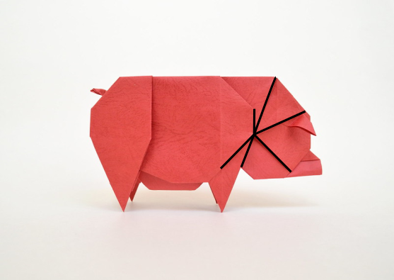
Again, looking at the first image below, one can see that the lines are strictly based on multiples of 22.5. The hind leg line defines the distinction between the torso and the leg. The combination of lines around the front leg forms a shoulder as well as a lower section for the fore leg.
In the image below, notice the symmetry between the front and hind leg sections. Utilizing symmetry can make a design more interesting.
In the next image, one can see that the marked 22.5 lines (edges of folds) radiate from a single point.
In addition, there are surface lines that emphasize “fatness” through layers in the belly and neck area. The line on the belly angles up, which shifts the weight toward the front.
Hierarchy of Layers
The third element is the hierarchy or direction of the layers. In other words, how are the model’s layers arranged? This is again based on the anatomy of the subject.
Below is a figure of the different layers in the pig design. The lighter the color the higher the layer is relative to others.
Here is another perspective. The arrows show the direction of the gaps between the layers.
The hierarchy of layers should be relatively intuitive, but also based on the designer’s preferences and on what the design of the model allows. In the pig example, the belly layer is lower than the torso, and the torso is lower than the hind leg.
Visible Creases
The fourth element is the visible creases in the final model that are not folded. They are either left from precreasing or added in after. In the pig example shown below, there is a vertical crease running down the front leg. The top was created during precreasing, and the bottom added in. The two near the ear were created during shaping.
In general, a model looks cleaner with fewer visible creases, so folders should try to limit unnecessary creases, especially during the precreasing process. However, there are times when adding creases helps to enhance or show certain geometric relations, such as the 45 degree crease near the ear. The vertical crease near the ear was unnecessary; I eliminated that crease in later folds of the pig.
Final Thoughts
While there can be other important design aspects, efficient and effective display of these four fundamental elements form the basis of a great model.


